No money? These will be the only fonts you need for design after you download them!
Updated whenever i find good open source fonts!
Also, these are not digitizations of normally paid fonts, but i recommend Libre Franklin and Clarendon if you're in that path.
Fraunces - Cooper Black, Windsor, New Kansas

Fraunces is a font that will succeed in almost any need for serifs! It's a revival of the "Old Style" genre, as well as the muddy black serifs from the 1970's! So, where does the "Cooper Black/Windsor" vibe come in? Well, check out "Fraunces SuperSoft Black". I recommend any size below 72pt, because the x height gets pretty low when you go over that weight. It also has beautiful italics, and even the signature Cooper F. If you don't have a program with advanced OpenType Features that's okay, you can also download a static version of all the sizes, softnesses, and weights instead of getting the variable version.
Besley* and Jost* - Clarendon and Futura
I decided to put these in the same section because they're both by the same foundry.
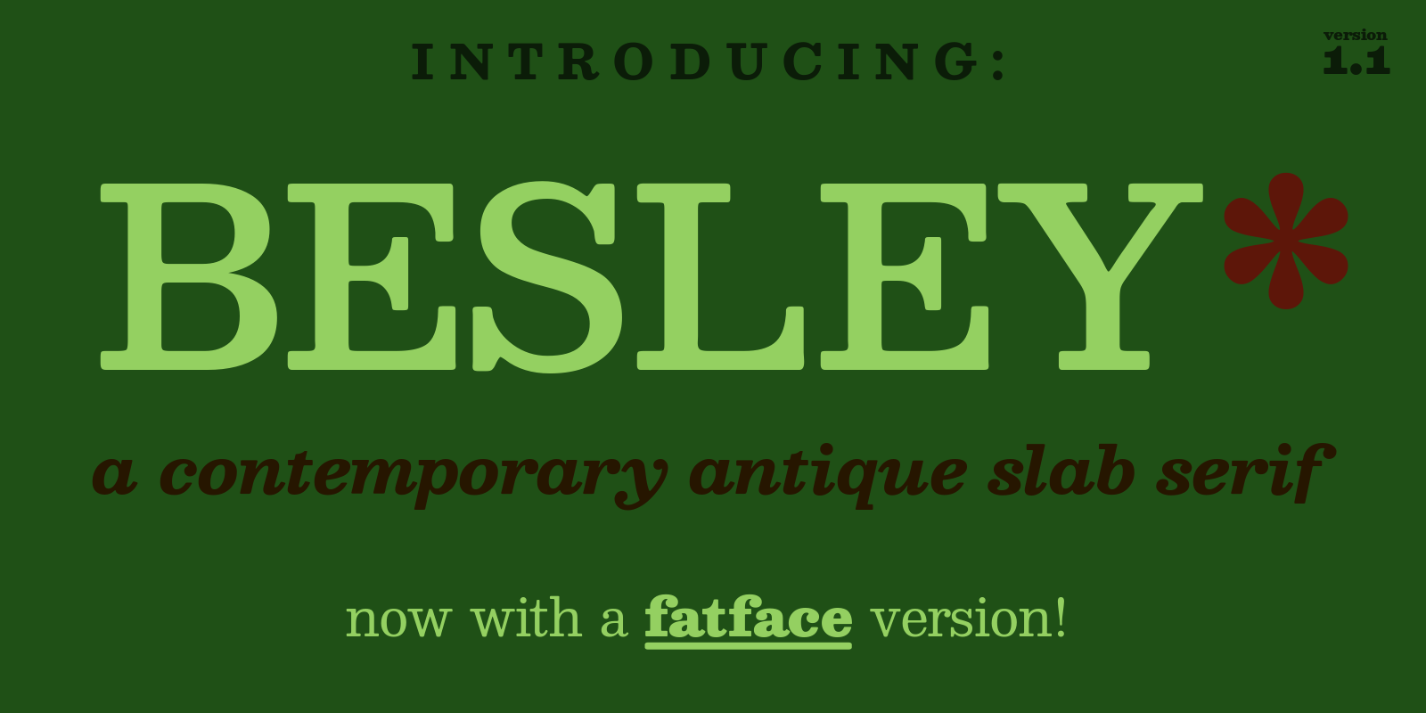
Besley is a beautiful redesign of Clarendon that contains italics! It comes in many weights, even fatface! Maybe we need a few more serifs than Fraunces, but this is a slab serif, not a normal serif --- okay?
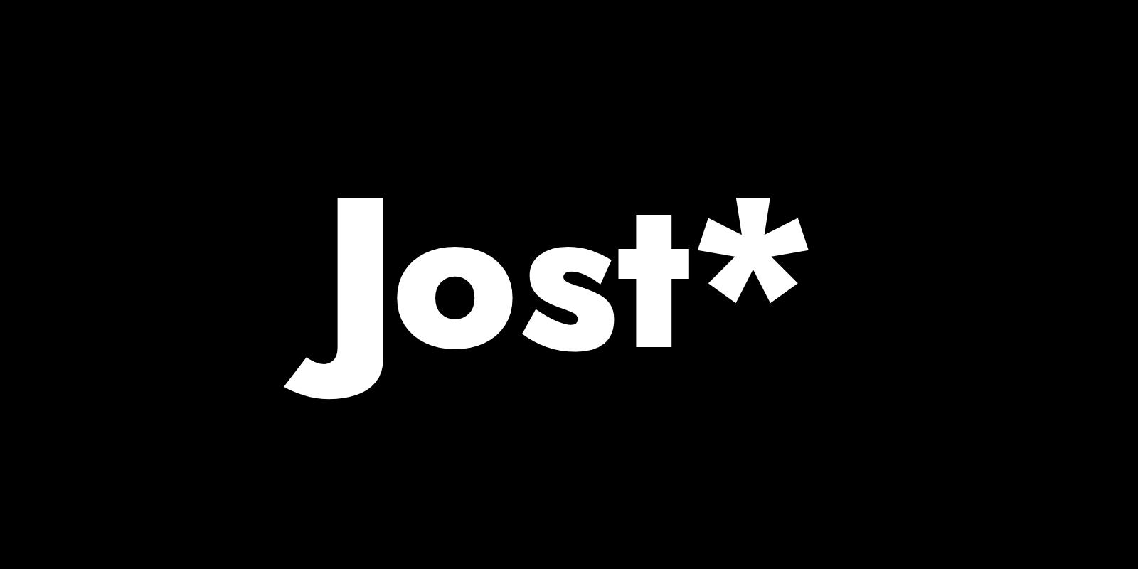
Jost is a font that tries to maintain the cool geometric attitude shown in fonts like Futura, while making a whole new font from scratch! If you miss the beautiful lowercase a in Futura, you can get it as an stylistic alternate- sadly only if you have OpenType features though.
Inter - Univers and Helvetica
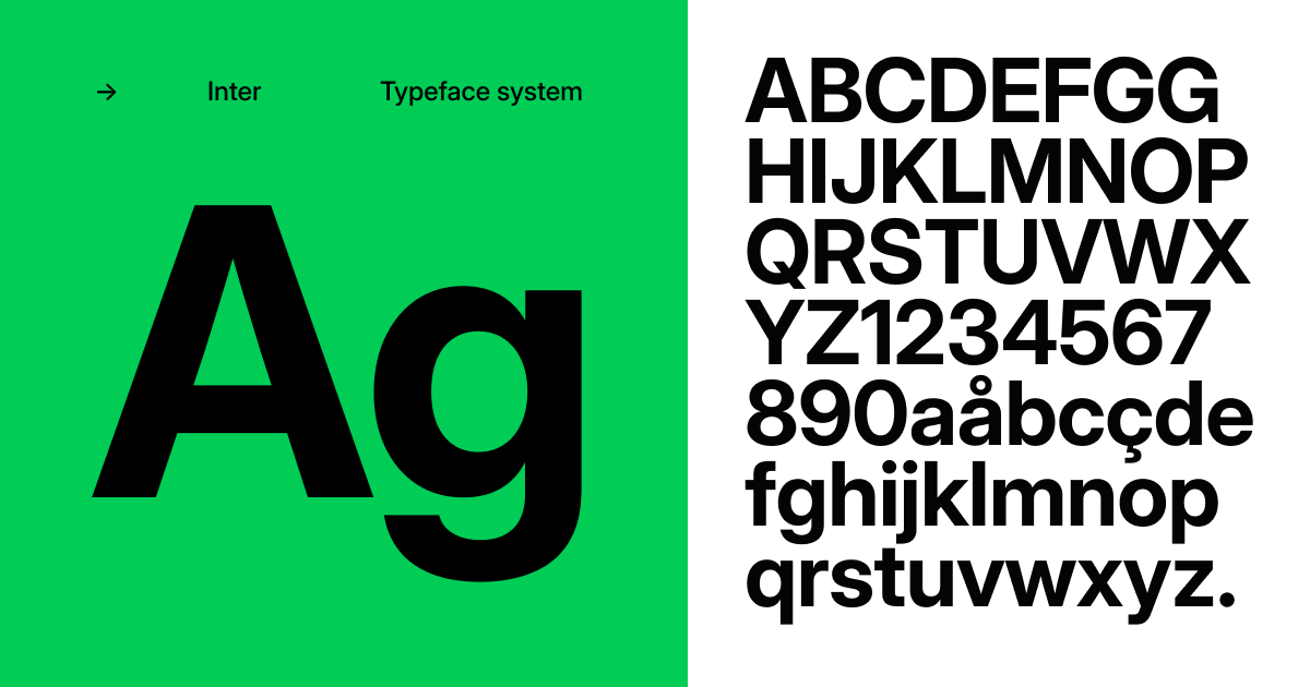
Inter is a nice Google font alternative to Helvetica. It has a clear inspiration from the neo-grotesque designs of the 1950s. It also seems to draw inspiration from the glyphs of Univers. There is also a version called Inter V, and we couldn't find a difference- maybe it's the kerning?
Roboto is also a good Google Font for Helvetica.
Bpreplay and Jellee - Rounded Fonts
Bpreplay seems to draw inspiration from VAG and Futura Rounded (even though they're identical fonts) and Jellee likely draws inspiration from Helvetica and Arial Rounded, especially with there being only a bold weight.
Try 'em out on their respective pages;
Times Newer Roman - remove the "er"

I couldn't resist adding this - It's not Nimbus Roman, so i guess it's inspired and not a direct copy.
Times Newer Roman is a cool modification of the Times New Roman design that modifies the x height and makes characters 5-10% wider.
It says it also saves the amount of words used in a 12pt document. I don't have any proof of that, but that sounds pretty good online.
Now you know Times Newer Roman exists, you're likely gonna ask; What's Times Old Roman?
And gladly, i have an answer for that- it's just called Times.
(Also, i just found out this is a modification of Nimbus Roman. Technically, i should scrap the first paragraph.)
Gidole - DIN

Gidole is a modernized version of the good ol font DIN, likely what indestructible type would do with the font. It doesn't look bad and is sadly only in one weight.
D-DIN - FF DIN

D-DIN is a font commissioned by the company Datto to Monotype. Gladly they have agreed to make it open source, making it free for everyone to use. Despite the name, this is not a digitization of DIN. Think more FF DIN, a completely new and different design with the odd style of the DIN typefaces.
RAILWAY - Railway humanist fonts, and Gill Sans
As the name implies, RAILWAY is a humanist font inspired by the London Railway fonts, and the very similar design of Gill Sans.
Vremena, Vremena Grotesk and Pressuru - Arial, Times, and Impact
All of these fonts are very nice tributes to Times, Arial, and Impact. They all have a distinguishing feature which is a Russian-style K (not


No comments:
Post a Comment